Nonprofit impact reporting is about more than financial data buried in a PDF. It’s how you prove your mission is working. And in today’s tight funding climate, it reassures donors, funders, and partners alike that you’re making a real difference.
We recently interviewed Heidi McMahon, who shared practical advice for defining, measuring, and communicating impact. Here’s what we learned:
What’s the difference between an annual report and an impact report?
Nonprofit annual reports and impact reports are similar but serve different purposes:
An annual report is comprehensive — including financial statements, donor lists, leadership updates, and shows overall performance and transparency. It's a fiduciary responsibility. And yes, it can be a bit overwhelming.
An impact report, on the other hand, is about storytelling. You can publish it any time of year and focus on one specific program or area of impact. It’s a way to show supporters why your organization shines, with specific outcomes like, “500 children attended camp thanks to this campaign.”
And a nonprofit impact report shouldn't be overwhelming. Its goal is to strengthen donor retention, build trust, and motivate your supporters to give more.
What are the most meaningful KPIs to track in an impact report?
Impact KPIs will vary based on the types of fundraising campaigns you're running:
- Peer-to-Peer events:
- Number of fundraisers or teams
- Average donation amount
- Average raised per participant
- Auctions:
- Number of items or bids
- Total catalog value
- Ticket sales
- Recurring giving:
- Growth in monthly donors
- Average donation amount
- Program outcomes:
- How many people or organizations we’ve supported
- How fundraising dollars translated into results—like adding new classes, services, or outreach
- Corporate giving:
- Number of employee volunteers
- Volunteer hours in total and per-person
- Payroll campaign results.
No matter what the KPIs, don't present them without context. Compare and show year-over-year trends that show momentum. And pair numbers with the human story behind them.
Let’s talk about the design and format of impact reports. What makes a great one?
Please, don't create a 30-page PDF in 10-point font! Think about impact reporting as storytelling — not paperwork.
Here are a few best practices:
- Make it visual: Use charts or data visualizations instead of tables.
- Keep it mobile-friendly: Many people scan reports on their phones.
- Use real photography: Authentic, candid photos from your programs are far better than stock images, even if the quality isn't as good.
- Repackage the report into different formats: Instead of publishing one long report, break it into “snack-sized” posts, one-pagers, and images you can share year-round on social or email. Different audiences need different depths — board members want details, while casual supporters just want the highlights.
- Consider accessibility: Check your contrast, fonts, and ADA compliance using a tool like AccessibilityChecker.org.
You don't have to start from scratch. Canva has excellent nonprofit impact report templates.
What are great impact reports all nonprofits can learn from?
A few of our favorites include:
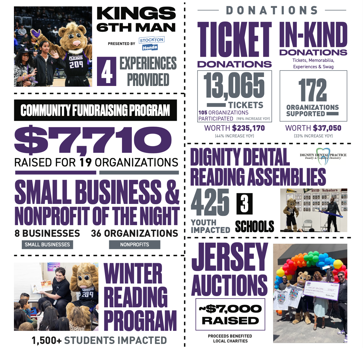
- Stockton Kings: This is an energetic one-page report filled with photos, big numbers, and corporate partner logos. It’s visual, fun, and easy to share.
- Family Promise: A traditional PDF that still feels heartfelt, complete with handwritten notes and family stories.
- 826 National: A youth writing nonprofit that centers student work first, using QR codes for interactivity and contextual stats (like “double the national average”) for credibility.
- Donors Choose: They show all-time impact, and let visitors dig into local impact. I also love that they encourage visitors to donate from within the report.
- The Ocean Cleanup: A dashboard that celebrates operational milestones along with impact, because major launches matter.
- Watsi: A slick web map that lets visitors explore each chapter, and grounds them with a personal story and photo.
Each shows there’s no one-size-fits-all format. The key is clarity, authenticity, and emotion.
Q: Any final advice for nonprofits creating their first impact report?
First, start small. Even one page of thoughtful data and storytelling is powerful.
Second, use it to build pride, connection, and internal morale. It’s not just a report — it’s a way to celebrate your community, thank your partners, and inspire future support.
Want to learn more practical tips about impact reporting? 📺 Watch the full Q&A replay here >