
You may not be a designer, but did you know that applying simple rules of psychology to design can make a big impact in how your donors give online? With a few small tweaks your nonprofit can achieve a results-oriented new look. Here are a few fun facts on psychology and design to ramp up your donation page!
#1 Fonts really matter:
Fonts impact how we read. Picking the right font can make or break your donation goal. Designer researchers Hyunjin Song and Norbet Schwartz conducted an experiment giving a group of people directions in two types of fonts: simple and fancy.
Their results showed that people who were given the fancy font - such as in old style or cursive writing - took 86% longer to follow directions!
Fancy fonts may seem nice to look at, but they should probably be avoided on your donation page. When donors have made it to the first step of giving, you want donation directions to be quick and easy to read - so keep it simple!
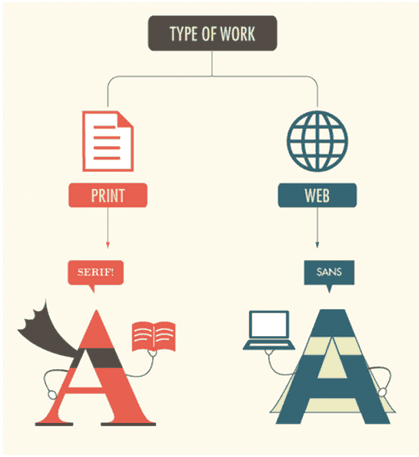
The simple fonts are commonly classified into serif, and sans serif. What's the difference? Serifs are the little lines on the edges of letters, which became popular with typewriters. 'Sans serif' are fonts without those lines. Sans serif fonts are better for viewing on a screen compared to serif fonts, while serif fonts are read easier in print. Aim to use Sans serif fonts for your online donation pages!
View the full infographic here.
#2 Pay close attention to colors:
Choosing the right colors can have a dramatic change in how your page layout is perceived by the viewer. Ideally, the best donation form design is one that syncs with your organization's logos, images and content. But, there are other factors that should be considered as well.
Did you know?
Certain colors evoke certain feelings and emotions. How do you want people to feel when they donate online?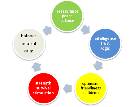
#3 Use images wisely:
If someone has made it to your online donation form, you want to ensure that the primary call to action is the one that matters most.
It's best to avoid the use of overly large photographs or images. However, smaller visuals are a great way to bring attention to your primary call to action; which in this case is getting your donor to submit the donation form.
Did you know?
Just as we follow the direction of arrows, we follow the line of sight of people in photos as well!
This Dove advertisement shows this concept well. Notice how the woman in the photo is looking towards the product's call-to-action arrows.

If you are considering an image on your donation page, make sure it doesn't take up too much space, and directs the line of sight of the viewer to the form.
We hope these tips help you refresh the look and design of your online donation form!

Get the latest trends and topics delivered to your inbox!
Subscribe to FrontStream's Blog